We talk a lot about energy, Australia as an energy superpower, the gas crisis as the shortage of domestic gas in the midst of gas being shipped off overseas. We talk a lot about decarbonisation of our energy sector, meaning electricity first and switching from gas to electricity second. We talk a lot about no new coal mines - but our coal power stations are closing down.
So what is going on?
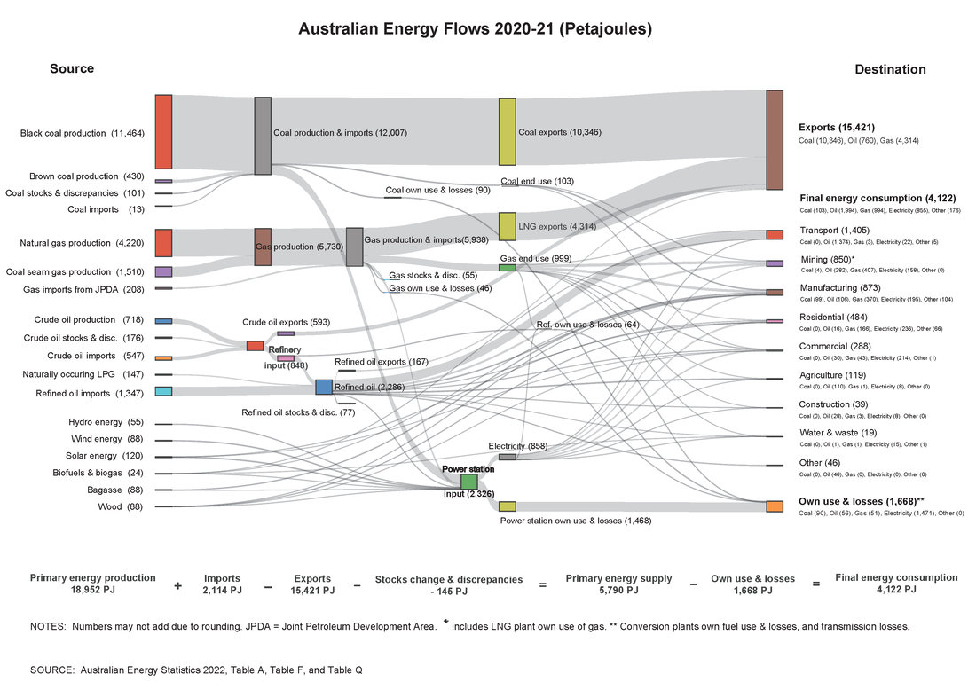
The energy flows diagram below helps understand. Broadly, each line describes the flow of fuels from sources on the left to uses or destinations on the right. Key take aways:
So what is going on?
The energy flows diagram below helps understand. Broadly, each line describes the flow of fuels from sources on the left to uses or destinations on the right. Key take aways:
- Overall 18.9 thousand PetaJoules (PJ, that is 1 with 15 zeros times the basic unit of energy) sources flows to 4.1 thousand PJ used in Australia. That is 3&1/2 times our domestic use goes overseas or is lost.
- So we are rich in energy, richer than most of the rest of the world, and:
- the cost of energy is result of decisions made to profit energy producers more than the actual cost of production.
- So we are rich in energy, richer than most of the rest of the world, and:
- Nearly 40% of our domestic use is the cost of production and delivery to users, including losses.
- look carefully, some lines go from renewable sources to uses without passing through power stations on their way to losses - generation at the point of use avoids or minimises energy waste.
- look carefully, some lines go from renewable sources to uses without passing through power stations on their way to losses - generation at the point of use avoids or minimises energy waste.
- Around one third is for transport.
- efficient use of energy transport can save a lot, that means electric motors over burning engines that lose 2/3 energy as heat.
- notice most of lines leading into that transport use are coming from imports - so our transport is as secure as our ocean shipping routes
- efficient use of energy transport can save a lot, that means electric motors over burning engines that lose 2/3 energy as heat.